lunes, 25 de junio de 2012

CPC Port / Kingsland + Architects

21 Junio 2012

Courtesy of Insight Media

We were given the task to design a single storey building, the ubiquitous factory / warehouse building with front office. A dissection of the program provided us with a simple theme. By nature of its program, the building consists of two independent spaces. The heart and soul of the building is the letter carriers sortation facility, a function likely defined as ‘blue collar’ and not far from functioning and appearing just like that of a “factory.

Courtesy of Insight Media

The office function requires a building that takes a corporate stance. The staff conveniences / amenities function requires a place where the staff can go to get a change of scenery, a break, a place where time is spent before and after work, lunch time and coffee breaks, a place to change and wash up, a place where training occurs, where union talks occur and staff meetings. We saw these functions requiring a building that says “I’m recreational/educational”.
 
floor plan

Material/ Products
 The heavy, austere pre-cast concrete façade of the “factory” portion of the building, typical to all CPC LCD predecessors, in stark contrast to the light appearance and transparency of the glazed “corporate” and “recreational” building component, creates an interesting juxtaposition of forms. Turning this building focus towards the interaction between the two forms morphed a site and program specific intervention into a structure more closely resembling architecture.
 
site plan

Contribution Towards Sustainability
 • It was required that this new facility be designed to and be applied for LEED registration. The building is targeted for a LEED Certified designation but may have enough points to warrant LEED Silver.
 • Consideration for solar and wind orientation
 • Drought tolerant planting and naturalization
 • Surface porosity for ground water recharge decreasing the need for storm water retention
 • Wetlands and bio-swales to help treat parking lot wastewater
 • Interior surface reflectivity for optimising day-lighting potential
 • Shade trees
 • Low VOC building materials & FSC lumber
 • Low-flow plumbing fixtures and appliances to conserve water in the building
 • A natural day-lighting strategy via roof monitors with diffusing Okalux glazing
 • Natural ventilation to reduce the need for air conditioning and high-performance glazing to lower the building’s energy demand and increase occupant comfort and control


http://www.archdaily.com/216582/cpc-port-kingsland-architects/


Pfizer Canada inc Siege Social / Menkès Shooner Dagenais Le Tourneux Architectes

14 Marzo 2012
The Pfizer Canada reconfiguration project makes a very clear statement. The architectural design focuses on promoting the corporate identity of the company located on the Trans-Canada Highway. The strategy is to use the building space in a transparent and expeditious manner through the prominence of glass in the structure in order to open the corporate headquarters to the world. To ensure a corporate image that is solidly embedded in the site, we worked around the idea of blister packs. This important feature of biopharmaceutical production is used as the visual key for the completion of the building facade, walls and furnishings.

Courtesy of Menkès Shooner Dagenais Le Tourneux Architectes

The alveolate structure has been transposed to create an elegant motif displaying a variety of textures that responds to the changing light. The screen openings of the facade reproduce both the scale and the texture of the local brick, which are enriched through a wide range of colors ranging from silver to gold. The blue of the Pfizer logo is also very visible and create a recurring theme; it occurs both on the external facade and in the core of the building. A bond is created between the industrial park, the highway, the company and the building space. Vivid and contemporary, the facades give expression to the unity of the whole. Inside, the redefinition of the site offers brand new, healthy and inspiring workspaces leading the way to a greater economic impact while attracting utmost qualified employees. 
Courtesy of Menkès Shooner Dagenais Le Tourneux Architectes

Change in culture. The occupancy ratio between common areas and closed offices went from 44/56 to 85/15. Eight hundred and sixty individual work stations have been streamlined and opened up through innovative design to increase productivity and the comfort of users. They focus on intercommunication between employees and an enhanced approach to cooperation. The interconnections are tangible: work, relaxation and service areas have been designed to innovate and optimize the sharing of ideas. All work stations are enclosed by lateral and transversal traffic corridors to ensure fluidity and ease of movement between groups.

Physical departmental barriers have been removed in order to promote the social values of the company. Access points offer the possibility of modifying group working areas, particularly in terms of workloads. Flexible and open work areas have been developed as well as private areas, glassed conference areas with a view over the gardens and the work rooms located on the periphery of the working areas. The result of this organization is a fluid ring of traffic. The full redefinition of work functions and qualities for employee work stations ensures that employees will discover new ways to live and work.

Courtesy of Menkès Shooner Dagenais Le Tourneux Architectes

The construction materials used, such as clear and opaque glass, aluminum and wood, reflect ambient light to create texture. The distribution and arrangement of these primary materials also highlight the multiple functions of various spaces. The entrance way to the main building offers luminous integration to the new façades which act as curtain walls. Materials were chosen not only for quality and longevity, but also for their technical features and plasticity.

The design concept is based on the enhancement and the democratic access to natural light, in order to ensure that it illuminates each work station. The floor plan made possible the generous use of windows to ensure an abundance of natural light and views. All work areas are bright and luminous. The closed offices and conference rooms have windows and are located in the central nucleus of the building in order to benefit as much as possible from borrowed light. Thanks to an open design, most work areas have optimal access to natural light.
http://www.archdaily.com/216594/pfizer-canada-inc-siege-social-menkes-shooner-dagenais-le-tourneux-architectes/

jueves, 7 de junio de 2012

Yandex Odessa Office / Za Bor Architects

14 Marzo 2012
Yandex, the largest Russian IT company has recently opened its new office in Odessa, Ukraine. It is located on the 8th floor of ‘Morskoy-2’ business center. A 1760 sq. m. office is arranged around a light shelf and is tailored for 122 workplaces. Close to the atrium are the spaces, with no need for intensive lighting — meeting rooms, lecture hall and other premises, which are not used on a regular basis. Work areas are open-space and are mainly located along the windows. The windows, by the way, are facing the Black Sea and the picturesque port of Odessa. There are just several separated premises here: coffee-point, meeting rooms, canteen, and the sports zone, with table tennis, foosball, cardio-vascular machines and gymnastic accessories.
Internet and electrical communications are distributed through the ceilings, and electrical wires are hidden under the raised floor in open-space. Peter Zaytsev and Arseniy Borisenko, the architects from , who have designed their 9th office for Yandex, comment on it’s idea: «We had an aim of creating a bright representative office, it had to become extraordinary and memorable. Odessa is a maritime city, that’s why we have tried to use the maritime motifs, but unobtrusively.
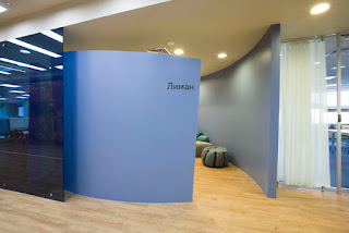
The maritime theme had been used very gently in decoration. For example, there are light-diffusers in the form of sails, and the walls are covered with copper (which reminds us about rusty ship’s hull or boiler of a steamboat), also there are large round mirrors – they look like illuminators, and the white streamlined flowerpots have a lot in common with contemporary yachts or submarines. The maritime atmosphere is even increased by blue carpets and window tinting.
Nevertheless, all these decoration elements always have their own specific function: for example, the ‘sails’ sound-proof effect, flowerpots are effective in zoning to separate workplaces from corridors, etc. The maritime aesthetics is highlighted by windows, which open a marvelous view to the seaport with its saturate yellow cranes».
The project has a lot of difficult details, e.g. the copper wall covering was implemented as it only at the second try: it took long choosing a right reagent to receive the projected effect — finally acetic acid was chosen. Each one of the «sails» is truly unique and has its own size and shape: the first prototype was developed and then hanged up in manufacturers office in Moscow — only then the development of 21 pieces had started. They not only soften the light, but, as well as Ecophon acoustic material, which covers ceiling in work areas, they give an obvious sound-proof effect. It is even enhanced by wooden elements of the ceiling in reception zone (which sends us back to wooden ship details). Reception desk was also custom-built and has its unique geometry, but its shape reminds about an arrow, as well as other reception desks in Yandex offices.

  It is interesting that floors are also unique here: the parquet board is laid in all different directions which gives geometric rhythm, and that is underlined by Corian white stripes.

 http://www.archdaily.com/216552/yandex-odessa-office-za-bor-architects/