 |
| © Luke Hayes |
Located five minutes walk from the main gallery building in London's Kensington Gardens, the Serpentine Sackler Gallery opened earlier this week. Exhibition spaces occupy a renovated nineteenth century munitions store, while the restaurant is housed in a new structure that curves out from one side.
"The idea here was to use a new material - a tensile structure - and to look at domes and a shell structure to achieve a lightweight contemporary project," said Zaha Hadid at the launch.
Describing the contrast between the new and old structures, she said: "We don't look forward by looking backwards. It is necessary sometimes to be able to match and be adjacent to historic buildings. The idea here was to really prove that you can have these two worlds, which are the new and the old, and then the garden and the park together in a seamless way."
"This structure is meant to be a very contemporary light touch that leaves the existing structure autonomous," added senior designer Patrick Schumacher. "I think we have achieved the acuity of space and structure, of sculptural elegance, lightness and transparency."
This year's Serpentine Gallery pavilion by Japanese architect Sou Fujimoto is also still on show nearby and features a cloud-like grid of steel poles.
Statement from the architects:
The Serpentine Sackler Gallery, Zaha Hadid Architects
The Serpentine Sackler Gallery consists of two distinct parts, namely the conversion of a classical 19th century brick structure – The Magazine – and a 21st century tensile structure. The Serpentine Sackler Gallery is thus – after MAXXI in Rome – the second art space where Zaha Hadid and Patrik Schumacher have created a synthesis of old and new.
The Magazine was designed as a Gunpowder Store in 1805. It comprises two raw-brick barrel-vaulted spaces (where the gunpowder was stored) and a lower square-shaped surrounding structure with a frontal colonnade. The building continued to be in military use until 1963. Since then The Royal Parks used the building for storage. The Magazine thus remained underutilised until now. Over time, much amendment and alteration hasoccurred inside the historic building and its surroundings.
Instrumental to the transformation into a public art gallery was the decision to reinstate the historic arrangement of The Magazine building as a free standing pavilion within an enclosure, whereby the former courtyards would be covered and become internal exhibition spaces.
In order to reveal the original central spaces, all non-historic partition walls within the former gunpowder stores were removed. The flat gauged arches over the entrances were reinstated whilst the historic timber gantry crane was maintained. Necessary services and lighting were discreetly integrated as tonot interfere with the ‘as found’ quality of the spaces. These vaults are now part of the sequence of gallery spaces. The surrounding structure has been clarified and rationalised to become a continuous, open sequence of exhibition spaces looping around the two central powder rooms, thus following the simplicity and clarity of Leo von Klenze’s Glyptothek as an early model for a purpose-built gallery.
What was a courtyard before, became an interior top-lit gallery space. Longitudinal roof lights deliver natural daylight into the whole gallery sequence surrounding the central vaults and witha fixed louver system they create perfectly lit exhibition spaces. Retractable blinds allow for a complete black-out of the galleries. The continuous sky-light makes the vertical protrusion of the central core of the building (containing the two vaults) legible on the inside. These reconstructions and conversions were designed in collaboration with heritage specialist Liam O’Connor and in consultation with English Heritage and Westminster City Council. In addition to the exhibition spaces the restored and converted Magazine also houses the gallery shop and offices for the Serpentine’s curatorial team.
The extension contains a generous, open social space that we expect to enliven the Serpentine Sackler Gallery as a new cultural and culinary destination. The extension has been designed to complement the calm and solid classical building with a light, transparent, dynamic and distinctly contemporary space of the 21st century. The synthesis of old and new is thus a synthesis of contrasts. The new extension feels ephemeral, like a temporary structure, although it is a fully functional permanent building.
It is our first permanent tensile structure and realisation of our current research into curvelinear structural surfaces. The tailored, glass-fibre woven textile membrane is an integral part of the building’s loadbearing structure. It stretches between and connects a perimeter ring beam and a set of five interior columns that articulate the roof’s highpoints. Instead of using perimeter columns, the edge beam - a twisted ladder truss supported on three points - dips down to the supporting ground in front, in the back, and on the free west side. On the east side this edge beam (and thus the roof of the extension) swings above the parapet of The Magazine. A linear strip of glazing gives the appearance that the roof is hovering above The Magazine without touching. The Magazine’s western exterior brick wall thus becomes an interior wall within the new extension without losing its original function and beauty. This detail is coherent with the overall character of the extension as a ‘light touch’ intervention. The envelope is completed by a curved, frameless glass wall that cantilevers from the ground to reach the edge beam and fabric roof.
The interior of the new extension is a bright, open space with light pouring in from all sides and through the five steel columns that open up as light scoops. The anticlastic curvature of the roof animates the space with its sculptural, organic fluidity. The only fixed elements within the space are the kitchen island and a long smooth bar counter that flows along The Magazine’s brick wall. The tables, banquets and chairs are designed as a continuous Voronoi pattern, reminiscent of organic cell structures.
Our aim is to create an intense aesthetic experience, an atmosphere that seems to oscillate between being an extension of the delightful beauty of the surrounding nature and of being an alluring invitation into the enigma of contemporary art.
 |
| © Luke Hayes |
 |
| © Luke Hayes |
 |
| © Luke Hayes |
 |
| © Luke Hayes |
 |
| © Luke Hayes |
 |
| © Luke Hayes |
 |
| © Luke Hayes |
 |
| © Luke Hayes |
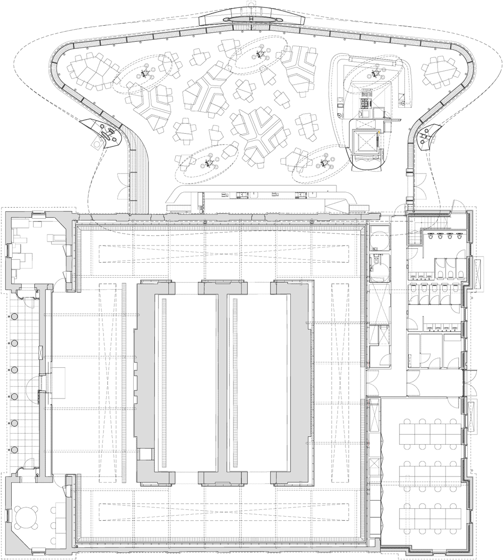 |
| Ground floor plan |
 |
| Roof plan |
 |
| Basement floor plan |
 |
| Long section |
 |
| Cross section |
 |
| Front elevation |
 |
| Side elevation |
 |
| Rear elevation |
http://www.dezeen.com/2013/09/27/serpentine-sackler-gallery-by-zaha-hadid-photographs-by-luke-hayes/


