viernes, 28 de febrero de 2014

LF USA Womens Apparel Group / Spacesmith


© Paúl Rivera
Descripción de los arquitectos. Desde 2011, Spacesmith ha estado trabajando con Li & Fung, una empresa multinacional con sede en Hong Kong, y líder reconocido en el diseño, el abastecimiento y la distribución de ropa y accesorios para los minoristas prominentes. Este proyecto consolida todas las marcas de ropa de mujeres de LF USA en un solo piso de 100.000 pies cuadrados en el Empire State Building.

Spacesmith desempeñó como arquitecto ejecutivo para el proyecto, que fue diseñado por la empresa B & Co de Hong Kong. El programa incluye más de 25 salas de exposición, múltiples áreas de trabajo de diseño, una biblioteca de telas, una sala para hacer patrones, probadores para modelos, oficinas, salones, una gran sala de prensa multi -función, y una sala de telepresencia que trae virtualmente a los colegas en el extranjero a la misma mesa de conferencias.
Las actividades del día a día en el espacio abarcan muchos elementos para la producción de prendas de vestir, desde el diseño y el abastecimiento hasta las pruebas y la comercialización, por lo que el cliente solicitó una estética industrial. Tuberías, conductos y muros de albañilería quedan expuestos, las carpinterías conservan su color natural, y lámparas de Edison cuelgan para ayudar a iluminar el espacio. Pisos de concreto pulidos y una paleta de colores neutros permiten que los productos destaquen sobre el entorno.

Se accede en una zona de recepción de doble altura que cuenta con un muro – pantalla de 12 pies que muestra las últimas tendencias de pasarela creadas por los diseñadores de LF USA. La galería de exhibiciones está enmarcada por una suave pared curva acabada en chapa de hormigón DFB Vitruv. Estas habitaciones se utilizan para mostrar las últimas tendencias de las casas de moda representativas de Li & Fung.

El proyecto cumple con los rigurosos estándares de sostenibilidad del Empire State Building. Sistemas mecánicos eficientes y sistemas de control de temperatura se han integrado y se utilizan acabados, pinturas y adhesivos no volátiles para asegurar el mejor comportamiento ambiental interior. Se especifican accesorios de plomería de bajo flujo y electrodomésticos Energy Star para todo el espacio. Sensores de iluminación día ajustan automáticamente los niveles de iluminación para complementar la cantidad de luz natural que ingresa por las ventanas de 9’8 “. El proyecto esta anticipando la certificación LEED Gold.


© Paúl Rivera

© DFB Sales

© DFB Sales

© Paúl Rivera

© Paúl Rivera

© DFB Sales

© Paúl Rivera

© DFB Sales
Planta


http://www.plataformaarquitectura.cl/2013/12/31/lf-usa-womens-apparel-group-spacesmith/

miércoles, 26 de febrero de 2014

Zero Energy School

© Florian Kleinefenn
Mikou Design Studio completed a zero-energy school in Saint Ouen, designed in order to be emblematic of the sustainable development of the Zac des Docks project and to be a strong architectural landmark in its neighbourhood.
The Docks school in Saint Ouen is in a strategic urban location, in the middle of the Zac des Docks mixed development area, which an exemplary case of sustainable urban development.

Located in the middle of an urban complex composed mainly of high-rise office blocks and housing, it will also be visible because of its roof, a fundamental feature of the project onto which the openings of neighbouring buildings face.

Mikou Design Studio designed this amenity to consume zero energy in order to be emblematic of the sustainable development of the Zac des Docks project and to be a strong architectural landmark in its neighbourhood, which is exemplary by its choice of siting, by the interior comfort provided for the children – particularly in the design of the school playgrounds and gardens – and by the treatment of the areas of photovoltaic panels, which are integrated into the architecture and are visible from the main street, giving the school a strong educational identity.

The building’s siting facilitated south-facing orientation of all the classrooms and playgrounds in order to make the greatest possible use of passive solar energy. This spatial disposition also made it possible to increase the surface areas on the south required for the photovoltaic panels which were integrated into the architecture of the covered playground areas.

Therefore the scheme is in the form of a mass built in stepped tiers on the east, on the main street, which is extended by large canopies and which folds in crosswise strips on the site’s diagonal to face southwards.

These stepped crosswise strips are separated by internal gardens which open wide east-west transparent views into the school while allowing clear identification of the various teaching areas open to the light and to the peace and quiet on sheltered internal patios.

Facing southwards, the school is arranged in a succession of gardens and volumes in brightly-lit terraces which gradually descend to free the view and to let in maximum sunshine.


© Florian Kleinefenn

© Florian Kleinefenn

© Florian Kleinefenn

© Florian Kleinefenn

© Florian Kleinefenn

© Florian Kleinefenn

© Florian Kleinefenn


© Florian Kleinefenn

Maquette (© Mikou Design Studio)

Sun Diagram (© Mikou Design Studio)

Section and Façade (© Mikou Design Studio)

Ground Floor Plan (© Mikou Design Studio)

Roof Plan (© Mikou Design Studio)


http://www.domusweb.it/en/architecture/2013/12/27/zero_energy_school.html

viernes, 21 de febrero de 2014

SUGAR LUMP & SALON BY SOHEI NAKANISHI


“Surrounded by the calm and peaceful atmosphere of traditional castle town where gentle breeze slowly flows. But people and city change with the march of times.

City is changing its place from slow but tasteful warm style to convenient but impersonal style. Cheapness and convenience shouldn’t be the priority. To ‘Choose’ what you really want is most important. Would want the place to be where you can feel the importance of relationship and the attitude to always have a focus on anything.

Any people have a will to become beautiful. This salon will offer the ‘existence’ which people can rediscover the importance to invest in oneself rather than to easily leave the life to ‘convenience’. We want to be the place where people can wake up to the loveliness close by which you normally aren’t aware of by only giving a little spice to the daily life dominated by convenient and cheap but colorless things.

We will drop a lump in the city and people’s life to enliven their simplified life as if the lump raises the blood sugar level.

The whiteness of lump stands out by the existence of shade and the white and shiny building stimulates the viewer’s sensibility.

In contrast to the exterior, the gray colored peaceful atmosphere covers the inside. Sunlight is streaming from the numerous windows and performs the gentle gradation. Have minimized the number of walls that constitute the room layout so that people can freely wander around the space. When you walk along the narrow corridor, you’ll find out the ‘library’ and ‘closet’ followed by the terrace of ivy full of sunshine. On the rainy day, the wet brilliant green will fill the senses.

There’s a pathway where you can enjoy the various view that changes depending on the direction you go. Lights will cover the space by various colors that change depending on the season and time. The plants arranged at the back of the space creates the balance of organic and inorganic which makes us sense the extraordinary space.

The conjunction of distinctive color and material, organic and inorganic element will stop the time and leads to the salon of high quality.”


http://mocoloco.com/vote/sugar-lump-salon-by-sohei-nakanishi/

miércoles, 19 de febrero de 2014

Production Hall Gruesch

© Stefan Mueller
Barkow Leibinger designed the third pavilion for Trumpf Grüsch completing the campus composed by the Start-up Offices and the Production and Research Building. A massing and wood construction that speaks for the alpine and agricultural/industrial context it is situated in.

Unlike the first two buildings, the Start-up Offices (2001) and the Production and Research Building (2004), which are stacked volumes that rotate above ramped excavations, the new pavilion is a low-lying freestanding temple-like building situated on a low concrete base.

Like the two existing pavilions the new one is offset from the others to ensure views and open orientations from and to the Prättigau Valley. The siting of the building is emphasized by its placement in a grass and wildflower meadow on three sides with the entrances on the rear campus.


The flat roof is constructed by laying laminated timber beams in two opposing directions on top of each other emphasizing the craft and logic of wood construction. The main beams are designed as twin beams (each 100 x 18cm), the purlins measure 60 x 12cm.

The massing and wood construction speaks for the alpine and agricultural/industrial context the building is situated in. The roof construction cantilevers beyond the glass facades aligned flush with the concrete base creating a covered (from snow and rain) exterior walkway around the four sides of the 48 by 68 meter building. In this way the pavilion is very much a tectonic of additive and repetitive timber elements that convey the weight and substance of this sustainable material. The timber roof and facade in turn rest on concrete columns and base. The wood (natural and stained) is complimented by galvanized steel folding service doors and beam caps to prevent excessive weathering of the wood beams.

The wooden facade has a column grid of 1.50 m. On the east and the west side the posts are doubled, so that they can “embrace” the purlins. The facade has triple glazing and external sun protection. Another component of the sustainability concept is the use of groundwater for heating and cooling with high efficient heat exchangers.

The interior is simply divided into spaces for production, a clean room of 700 sqm, lobby, loading and shipping bay and a compact office zone with a break area on top of it. Changing rooms and mechanical spaces are allocated to a partial lower basement level.


The spruce wood interior is stained white. To the lower edge of the main beam the hall has a clear height of 4.50 m. The depth of the roof construction is used for all structure, mechanical systems and lighting. These elements are exposed, visible, and matter of fact underscoring the industrial use of the building. The construction type and repetition of elements made this a very economical and fast-to-build structure. The total construction time was less than one year; once the concrete columns were situated, the entire wooden structure of the roof could be completed within two weeks.


© Stefan Mueller

© Stefan Mueller

© Stefan Mueller

© Stefan Mueller

© Stefan Mueller

© Stefan Mueller

© Stefan Mueller

© Stefan Mueller

© Stefan Mueller


http://www.domusweb.it/en/architecture/2014/01/03/production_hall_gru_sch.html

jueves, 13 de febrero de 2014

Edificio de oficinas de Pérez-Llorca

© Nacho Uribesalazar
Diferentes elementos de transición, como túneles de piedra negra que absorben la luz o fisuras en los muros que filtran la luz, fragmentando y subdividiendo el espacio, forman parte del léxico arquitectónico utilizado por los autores de esta importante obra de arquitectura interior.

Un importante despacho de abogados nos propuso a los arquitectos, el reto de intervenir el interior del edificio Castelar, el icónico edificio de la Castellana madrileña, obra del arquitecto Rafael de la Hoz. Debido a su plan de crecimiento, el despacho de abogados necesitaba adaptar el edificio para dotarle de oficinas con capacidad suficiente para alojar a 200 abogados y a otras 100 personas dedicadas a tareas no jurídicas (secretarias, administración, marketing, recursos humanos, informática, etc), 11 salas de reuniones de diversas dimensiones, un auditorio y una gran biblioteca que debía estar situada en el gran atrio central.

El proyecto se divide en dos, a partir de dos estrategias diferentes: la zona productiva (oficinas de abogados) ubicada en la torre suspendida de vidrio, y la zona representativa (recepción de clientes, salas de reuniones, auditorio y biblioteca) ubicada en la base del edificio.

En la torre el espacio se organiza en despachos independientes para los abogados, que se adosan a la fachada con un acabado sintético formado por vidrios, lacas y laminados de color gris claro capaces de soportar el desgaste diario y que difunden la luz por todo el espacio.

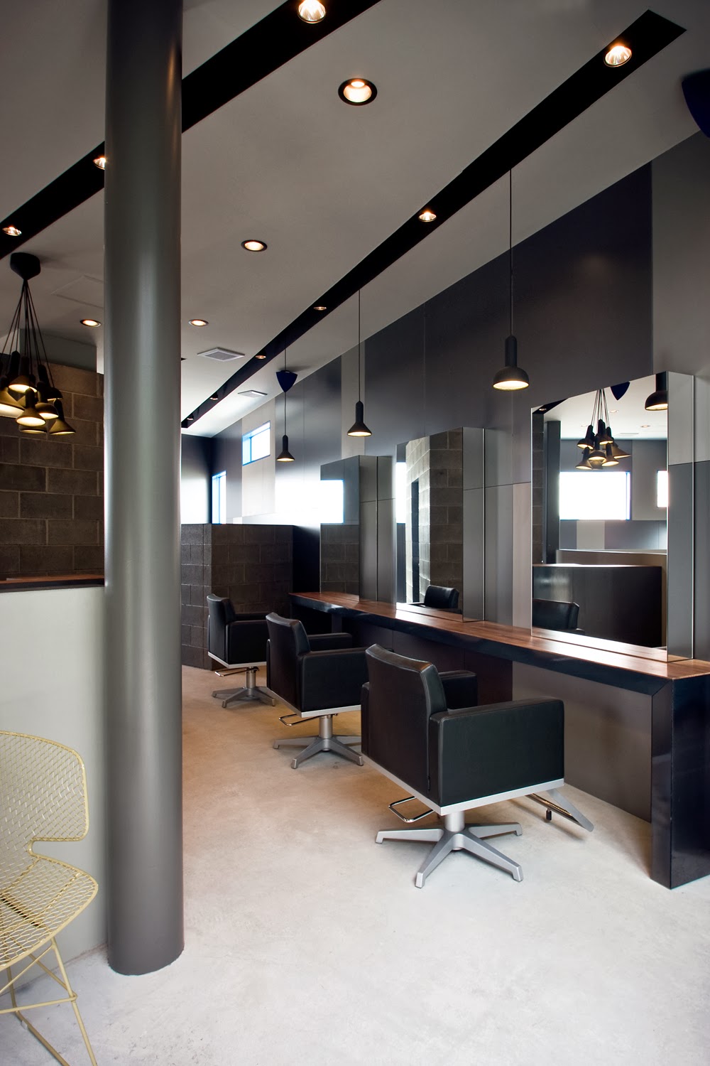
En la base, se decide actuar integrando los nuevos elementos añadidos, utilizando para ello el mismo lenguaje abstracto y mínimo del edificio existente, pero diferenciando lo original de lo añadido. Se introducen la madera de arce, el fieltro de lana natural y el acero inoxidable esmerilado como paleta de materiales que se integran con el travertino existente en el edificio y la piedra negra metamórfica de diferentes texturas y la luz artificial como materiales de contraste. En este conjunto se encuentran la zona administrativa, recepción, salas de reuniones, auditorio y biblioteca organizados del siguiente modo: Tras la gran escalinata, en el acceso, se ubica la recepción con un mostrador central, bruto y natural de piedra negra y madera de arce como elemento organizador y una zona de espera contemplativa como únicos elementos frente al telón de fondo de la piedra caliza en bruto bañada por la luz natural que entra por el gran lucernario.

La planta superior se destina completamente a espacio de reuniones. Las salas debían tener un alto grado de intimidad y privacidad. Los cerramientos debían ser opacos y conservar las conversaciones en su interior, pero a su vez queríamos conservar en la medida de lo posible la continuidad espacial característica de este espacio, de modo que en lugar de puertas, se diseñan unos muros pivotantes de gran espesor y tamaño que son capaces de aislar perfectamente las salas y a su vez permitir dar continuidad al espacio que conecta con la Castellana cuando no hay gente reunida en su interior.


© Nacho Uribesalazar

© Nacho Uribesalazar

© Nacho Uribesalazar

© Nacho Uribesalazar

© Nacho Uribesalazar

© Nacho Uribesalazar
http://www.ondiseno.com/proyecto.php?id=2094